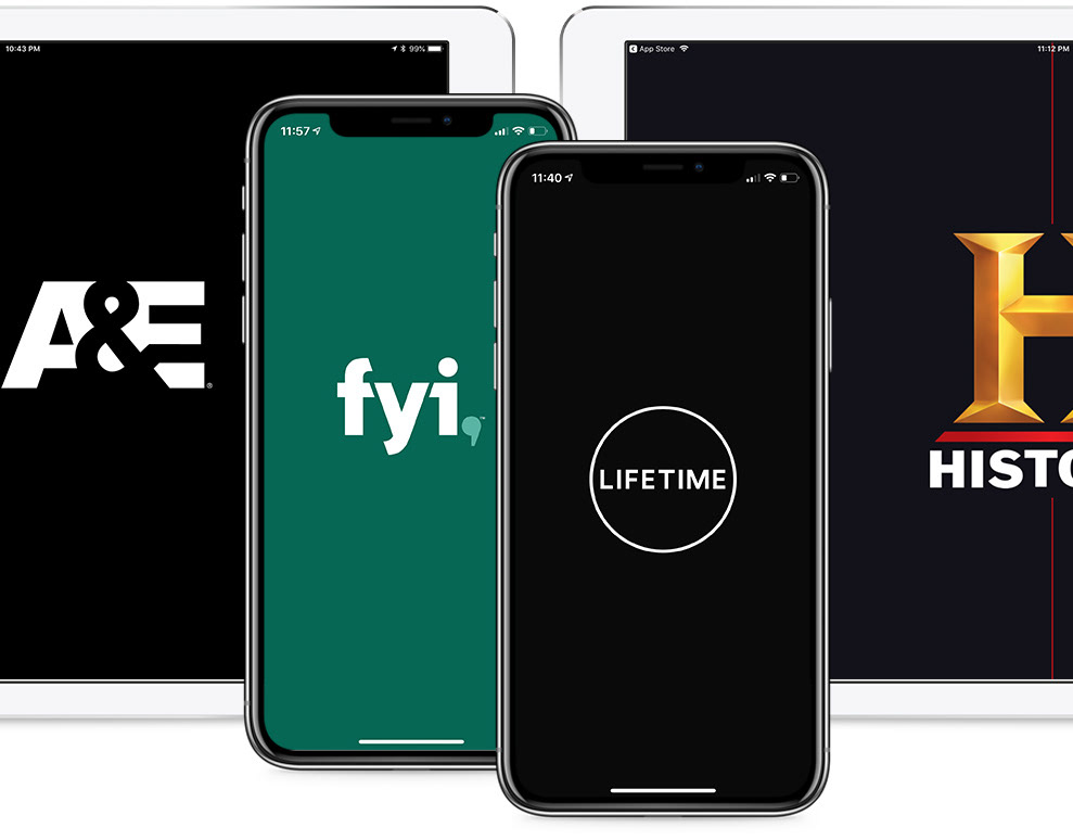
TV Everywhere Apps: Mobile & Tablet
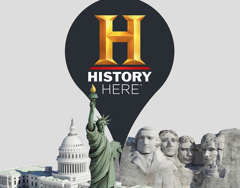
HISTORY Here: A Webby Award Winning App
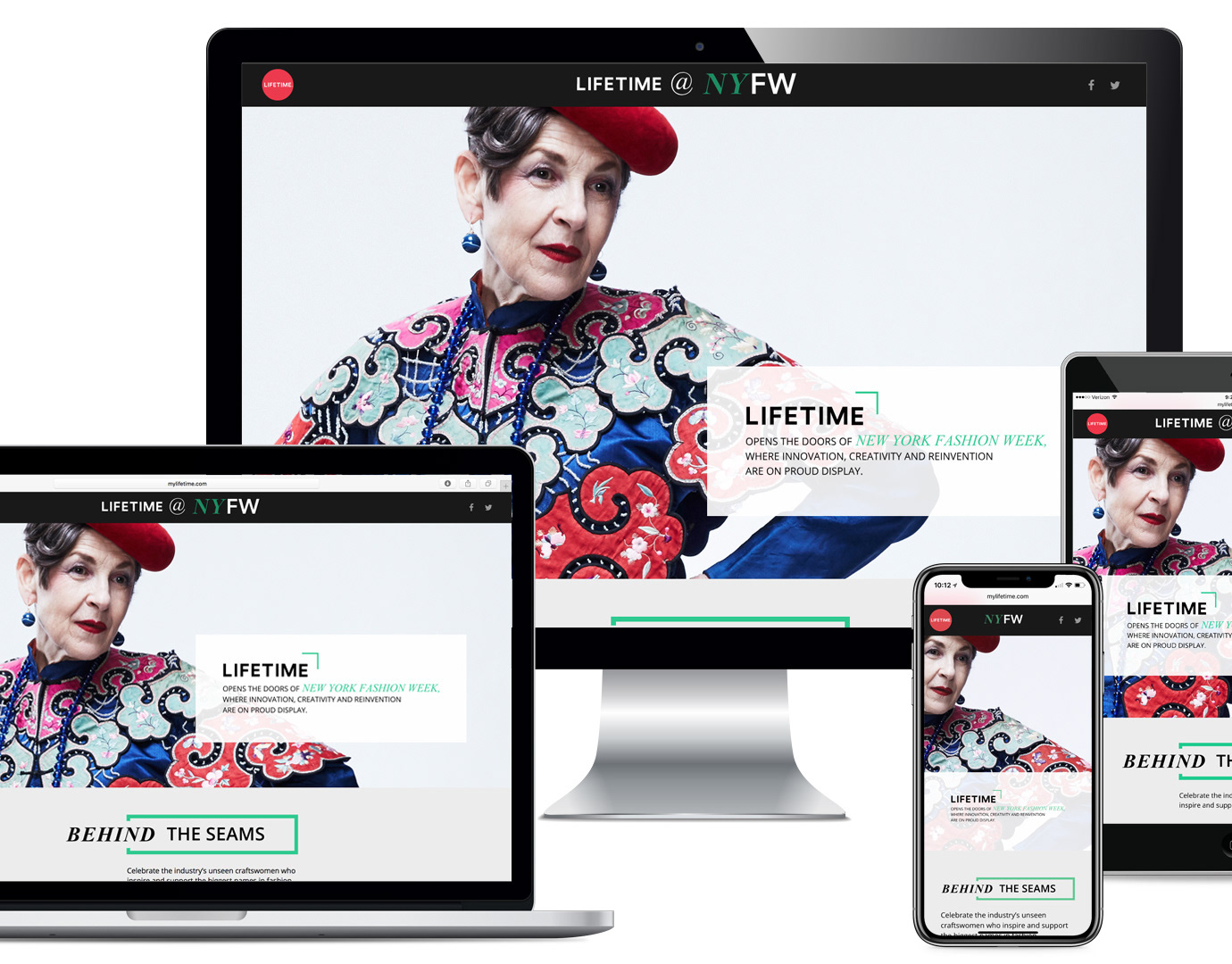
Lifetime @ New York Fashion Week: Editorial Web
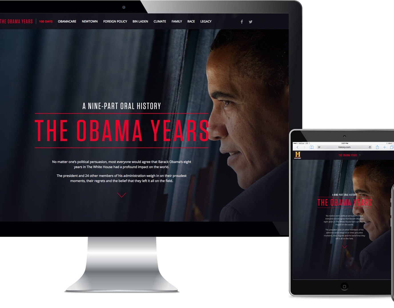
The Obama Years: A Nine-Part Oral History

HISTORY Vault: Subscription Video On Demand App
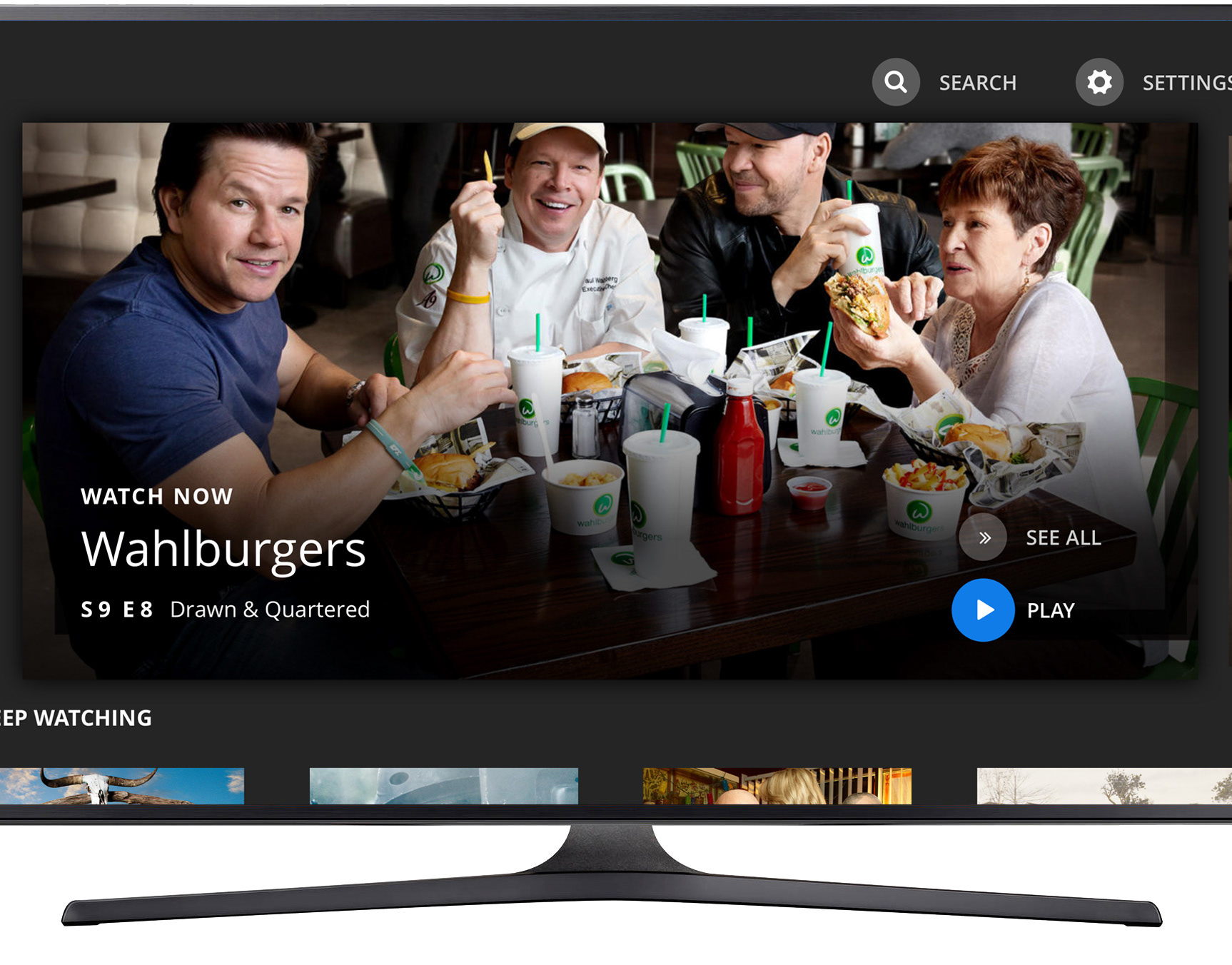
A Unified TV Everywhere Experience: OTT Platforms

Environmental Design in Dublin

A Museum-like Experience

In-House Agency Marketing Campaign
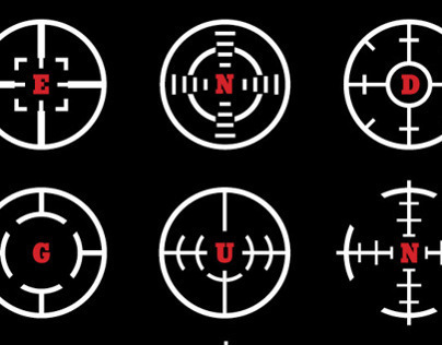
End Gun Violence Poster

Environmental Design in Charlotte
Environmental Design in Whitehouse Station

Environmental Design in Asia

Environmental Graphics in Memphis
Environmental Graphics in Summit

Avaya: Outdoor Signage and Website Marquee
indigoforce Identity

Environmental Design Pitch

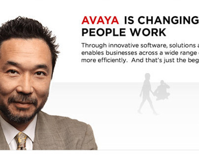
Avaya Unified Communications
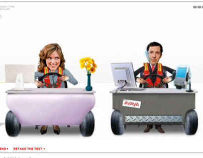
Avaya: UC Profiler
Avaya Stories Campaign

Avaya CRM Program: Email Marketing "E-Cultivation"

Ript: Software Design & Development

Oxygen Concept Homepage Designs

Talk Sex Fetish Flip N' Match Game